







Key Takeaways
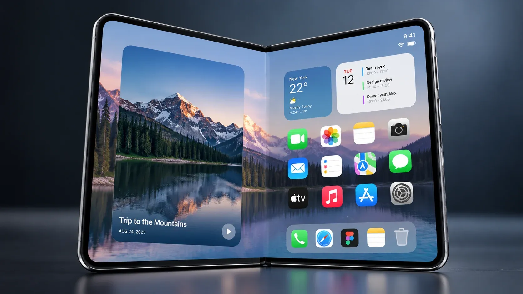
- iPhone Duo is Apple's first foldable iPhone, arriving October 2026 with iOS 27 and dual displays sharing the same aspect ratio, making responsive design crucial for modern iOS applications.
- Existing iOS apps will technically run on the new device, but only adaptive layouts will use the entire screen on the foldable display.
- Designers must plan for device poses, reserved regions around the hinge and cameras, and multitasking scenarios where the app no longer owns the full screen.
- Apple's iOS 27 APIs, including size classes, reserved regions, and posture aware layouts, along with standard system components, reduce the need for custom layouts.
- SoftDoes can audit, redesign, and modernize existing iOS apps to be iPhone Duo ready for businesses in the U.S. and Canada.
Introduction: Why Foldable iPhone UX Matters Now
At Apple's September 2026 event, the company introduced iPhone Duo alongside iOS 27, marking the arrival of the first foldable iPhone for the North American market. The device pairs an outer display sized like a standard phone with a larger inner display that unfolds into a tablet sized canvas. Both displays use the same aspect ratio, which simplifies how an iOS app scales between them. iOS 27.1 lets updated apps stretch across the entire screen instead of running as a small, letterboxed window.
This article focuses on practical, design first guidance for building new iPhone Duo experiences and modernizing an existing application. Responsive design adapts layouts to various screen sizes, and that principle now extends to a device that physically changes shape in the user's hands. At SoftDoes, we build adaptive iOS app experiences across form factors for enterprises and scale ups in the U.S. and Canada, and this guide reflects our approach to helping product teams prepare for what comes next through our broader product design services for web and mobile.
Understanding iPhone Duo Hardware and Device Poses
iPhone Duo has two distinct screens. The outer display is a 5.4 inch Super Retina XDR panel at 1398 x 2034 pixels. When the device opens, it reveals a 7.6 inch inner foldable display at 1878 x 2670 pixels. A precision hinge with over 100 components connects the two halves, and the device includes front facing cameras on both screens.
App developers need to account for several concrete device poses:
- Closed outer display. The user interacts with the 5.4 inch screen. The status bar, Dynamic Island, and camera cutouts define the safe area. Screen width is compact.
- Fully open inner display (portrait). The larger inner display provides regular width and regular height. The hinge seam runs horizontally across the center.
- Fully open inner display (landscape). The inner screen rotates, and the hinge runs vertically. Available space shifts significantly.
- Partially folded tabletop mode. The device sits on a surface like a laptop. The top half shows content; the bottom half can hold controls.
Both displays share a common aspect ratio, which reduces layout fragmentation. iOS 27 uses compact versus regular size classes to represent the outer and inner displays, and those size classes shift as the device folds and rotates. Use size classes to manage different display configurations rather than checking for specific models or resolutions.
From Fixed Layouts to Adaptive Layouts on Foldable iOS
Fixed layouts rely on hard coded widths, absolute coordinates, and full screen assumptions. Adaptive layouts use size classes, container bounds, and flexible stacks to fill whatever space the system provides. On iPhone Duo, the screen area changes as the device opens, closes, or enters split view multitasking, making adaptive layouts mandatory.
Designing apps for foldable iOS screens requires fluid, adaptive layouts. Apps with fixed dimensions may behave differently on iPhone Duo because the available space is never guaranteed.
Common anti-patterns in existing iOS apps include:
- Using UIScreen.main.bounds to calculate layout dimensions
- Setting absolute x/y coordinates or fixed widths for UI elements
- Checking device names in code (e.g., "if iPhone 15 Pro")
- Assuming the app always occupies the full screen
- Hard coding margins that assume symmetric safe area insets
Instead, use Auto Layout for responsive design across displays. Rely on size classes, safe area insets, and SwiftUI's flexible stacks to build layouts focused on available space rather than fixed orientations. Avoid hard coded dimensions to improve app compatibility across every iPhone, iPad, and the new foldable device.
Apple recommends using adaptive layouts for iPhone Duo support, and the same approach also improves behavior on iPads and larger iPhones without separate code paths.
Designing for Size Classes, Form Factors, and Aspect Ratio
Rather than designing for specific models or resolutions, think in terms of form factors: phone, foldable, and tablet sized. The foldable iPhone introduces a new form factor that sits between a standard phone and an iPad.
iPhone Duo's outer screen typically maps to compact width and regular height. The larger inner display becomes regular in both width and height. Use size classes to adapt layouts for different screen sizes and device poses, and adopt size classes to accommodate different display sizes on foldable devices.
Here is how a typical iOS app can respond:
Size Class | Context | Layout Example |
|---|---|---|
Compact width | Outer display, portrait | Single column feed, stacked navigation |
Regular width + height | Inner display, fully open | Two column dashboard, list plus detail side by side |
Compact width (split) | Inner display, split view half | Condensed single column with collapsed nav |
The shared aspect ratio between the outer display and larger inner display makes list detail and grid layouts easier to scale up without distortion. Design breakpoints around size class changes, not pixel counts, to keep layouts ready for future screen sizes.
Avoid fixed widths to ensure flexible UI across displays. Dynamic layouts help apps adapt to changing screen sizes, and that principle holds whether the device is a standard iPhone or a foldable display.

Let’s Turn Your Idea into Scalable Software
Book a call with the representative to get answers to all the questions you may have.
Using Apple's System Components Instead of Custom Components
System UI components gain foldable support automatically in iOS 27, while custom components must be tested and updated. This is where standard building blocks save significant development time.
For primary structure on the inner display, rely on:
- NavigationSplitView (SwiftUI) and UISplitViewController (UIKit) for list detail flows
- TabView and UITabBarController for tab based navigation
- Standard toolbars, sheets, alerts, and popovers
Use system containers like NavigationSplitView and TabView for dynamic layouts. These components automatically adapt around reserved regions like the hinge and camera areas without special case logic. They also handle collapsing sidebars and repositioning tab bars as size classes change.
Custom tab bars, side menus, and floating action buttons often assume flat edges and a single screen. When the device folds or rotates, controls sit in unexpected places or overlap the hinge. Ensure that navigation remains consistent and intuitive across device poses by refactoring fragile custom components toward system equivalents when modernizing existing iOS apps for iPhone Duo.
Layout Around Reserved Regions, Hinge, and Cameras
Reserved regions on iPhone Duo are zones where the app should avoid placing interactive elements. These include the hinge seam running across the inner screen and the front facing camera cutouts on both displays.
The iPhone Duo has a center hinge affecting content layout. The hinge creates a physical gap that can obstruct content, and when the device is partially folded, the folding region visually splits the inner display. Dynamic layouts should adapt to the hinge's position.
Design checklist for hinge and camera awareness:
- Avoid placing important elements directly on the hinge seam, including primary buttons, text fields, and navigation buttons.
- Use reserved regions to manage layout around the hinge area and to avoid content overlap with the hinge.
- Keep primary content columns on either side of the fold. Let only background color or non interactive elements span the seam.
- Add padding around camera cutouts on both the outer and inner screens.
- Query hinge and camera positions using iOS 27.1 reserved regions APIs in UIKit (UIView.reservedRegions) and SwiftUI (reservedRegions(kind:)).
- Respect reserved regions around folds to maintain usability and content visibility.
- Utilize APIs for handling asymmetric safe areas and navigation controls so that interactive elements never fall behind the fold or under a camera.
- Implement safe area insets to avoid content overlap with system UI and hardware features.
Design Patterns for Foldable iPhone Duo Experiences
Most foldable iPhone UX relies on a few repeatable patterns that scale from the outer to the inner display.
List detail pattern. On the outer display, the app shows a simple list. When the device opens, the larger inner display shows the list on the left and the detail view on the right. NavigationSplitView handles this transition automatically.
Dashboard layouts. On the inner screen, cards, charts, and data tables reflow into multiple columns. On the outer display or in a narrow split view window, the same content stacks vertically. Use responsive grids and avoid fixed dimensions.
Media and camera apps. The preview occupies one side of the inner display while controls, timelines, or capture options sit on the other. Pay particular attention to keeping interactive elements away from the hinge.
Dynamic content and controls should respond to screen transitions without excessive movement. Maintain consistent functionality across both displays of iPhone Duo by thinking in terms of compact versus expanded experiences rather than completely different designs. This approach helps reduce unnecessary navigation and keeps the interface familiar regardless of how the user holds the device.
Handling Device Poses, Multitasking, and Partial Windows
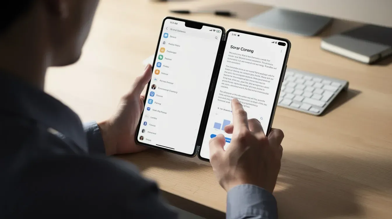
iOS 27 brings iPad style behavior to iPhone Duo, including split view and resizable iOS app windows on the inner display. iPhone Duo supports split view multitasking for multiple apps, meaning two apps can run side by side. iPhone Duo allows apps to resize dynamically during multitasking, and developers should avoid fixed layouts for multitasking support.
Apps can no longer assume they always own the entire screen. The app responds to the actual window size and current device pose, and apps must adapt to varying screen sizes during multitasking. Design layouts to adapt to the device's folding state and the window dimensions the system provides.
State continuity is critical. Maintain app state when transitioning between different poses of the device. When the device folds or unfolds, the app should preserve progress without jarring reloads or lost input. Examples:
- An email app continuing a draft while moving from the outer screen to the full screen inner display
- A banking app keeping filters and scroll position when the user opens the device or enters split view
User experiences on foldable devices should adapt seamlessly across multiple states. Apps should maintain functionality across different device poses. Focus on fluid multitasking to support side by side views on foldable devices, and test app performance across various states and configurations during development using the iPhone Duo simulator and Device Hub in Xcode to drag resize windows and switch poses.
Modernizing an Existing iOS App for iPhone Duo
Most existing iOS apps do not need a complete rebuild. Existing apps may run without a complete rebuild, but they will look and feel better if they receive a focused modernization plan.
High level migration path:
- Audit. Identify fixed layouts, hard coded sizes, device or orientation checks, and risky custom components in your existing app.
- Upgrade. Replace fixed logic with adaptive layouts. Move to the iOS 27.1 SDK. Remove UIRequiresFullScreen where appropriate to support foldable behavior and multiple scenes.
- Test. Verify every critical user journey across open, closed, and partially folded poses. Confirm split view behavior and display switching.
Prioritize high traffic flows: onboarding, sign in, checkout, and key workspaces. These are the critical user journeys that shape first impressions on the new device. Secondary screens can follow.
Use Auto Layout for responsive design across displays and implement safe area insets to avoid content overlap. Run regression testing on standard iPhones and iPads to confirm that Duo specific adjustments do not break the existing app experience. The goal is a consistent experience across every device your customers use, not only part of your lineup.

Benefits of Working with SoftDoes on Foldable iPhone Projects
SoftDoes is a North American software engineering partner with deep experience in custom iOS app development and adaptive architecture design. Here is what makes sense for teams preparing for the foldable iPhone:
- Compatibility audit. We review your existing iOS apps to identify fixed layouts, legacy constraints, and risky custom components that will break or underperform on the new display.
- Adaptive design and development. Our team designs layouts and navigation tailored to iPhone Duo using Auto Layout, SwiftUI, and Apple's latest iOS 27 APIs, so the app responds naturally as the device opens, closes, or enters split view.
- AI, cloud, and data integration. Our broader capabilities in AI/ML, cloud, and data engineering support intelligent features that improve productivity on the larger screen, from adaptive dashboards to context aware workflows.
- Regulated industry experience. For enterprises in finance, healthcare, and e-commerce, we ensure that compliance, accessibility, and privacy standards remain intact through every layout change.
If you are planning your iPhone Duo roadmap ahead of the October 2026 launch window, reach out to SoftDoes to create a modernization plan that ships on time.


Comments (0)
No comments yet.