







Key Takeaways
- Xcode 27.1 and iOS 27.1 are required to fully support new devices like iPhone Duo and future iOS apps across multiple screen sizes.
- Auto Layout, size classes, and trait collections remain the core tools for handling different screen sizes and foldable layouts.
- Developers in the U.S. and Canada should test on the latest simulators and real devices to protect an app's performance before the iPhone Duo launch on October 23, 2026.
- Reserved regions, vertical bars, and fold states are new layout constraints that must be handled explicitly in Xcode 27.1.
- Partnering with SoftDoes can speed up modernization of existing iOS apps for iPhone Duo and other new screen sizes.
Why Xcode 27.1 Matters for Multiple Screen Sizes
Apple's fall 2026 hardware cycle brings the biggest change to iPhone form factors in years. The iPhone Duo is a foldable device with two displays, multiple poses, and layout requirements that break assumptions baked into most existing iOS apps. Optimizing iPhone apps for screen sizes requires dynamic, environment-aware layouts that go far beyond what a single reference device can test.
Xcode 27.1 ships with the iOS 27.1 SDK and the iPhone Duo Simulator Runtime, making it the baseline tool for multi-screen-size optimization heading into 2027. If your app development workflow still targets a single screen width, you are already behind.
The problems teams face today are familiar: stretched layouts on large devices, clipped content on compact phones, and broken split views when users rotate or fold their device. This article provides a concrete, step-by-step outline to help development teams in the U.S. and Canada prepare their apps for every iPhone screen size, including foldable hardware. Whether you are building new mobile apps or modernizing legacy code, the principles here apply.
Understand Current and Upcoming iPhone Screen Sizes
Layout strategies must be based on real devices, not a single reference iPhone. Apple offers multiple screen sizes across its devices, and that range is growing.
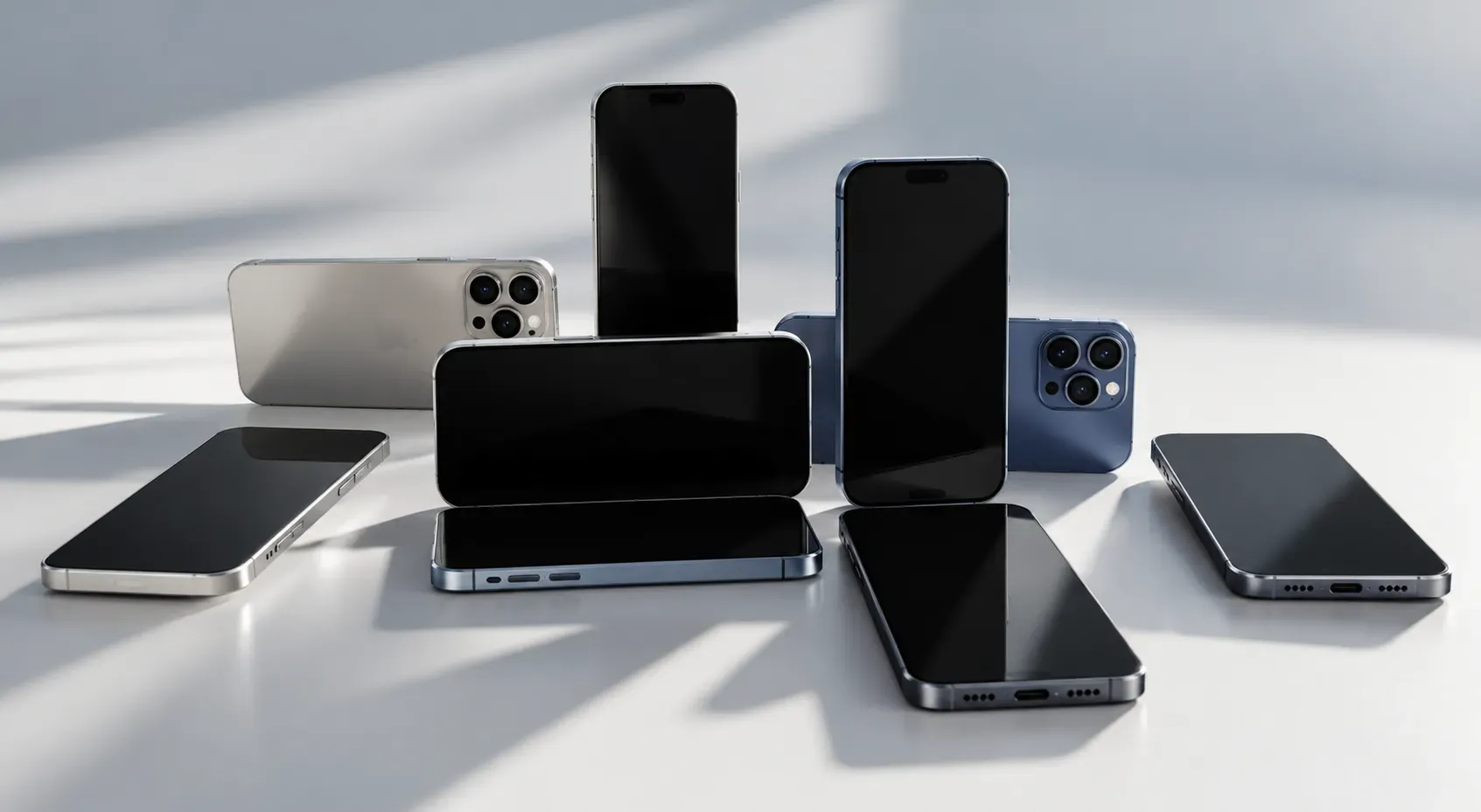
Here is a simplified overview of the 2026 iPhone landscape:
Device Family | Display Type | Approximate Size (points) |
|---|---|---|
iPhone SE | Retina | 375 × 667 |
iPhone 13/14 | Super Retina XDR | 390 × 844 |
iPhone 15 Pro Max | Super Retina XDR | 430 × 932 |
iPhone Duo (outer) | Compact | Similar to smaller iPhones |
iPhone Duo (inner) | Large, foldable | Comparable to iPad mini |
Older models like the iPhone SE utilize Retina resolution, while the iPhone 15 Pro Max features Super Retina XDR resolution. Apple's devices include iPhones, iPads, watches, and TVs, but the iPhone Duo introduces something entirely new: a compact outer display for quick tasks and a large inner display that changes effective screen size depending on pose.
iPhone Duo adds multiple poses (closed, partially open, fully open, rotated) that change effective screen sizes while the app runs. Your layout code must handle these transitions gracefully.
A quick note on units: iOS layout uses points, not pixels. Scale factors (1x, 2x, 3x) translate points to physical pixels. Always build layout calculations in points. Avoid hardcoded screen bounds in layout design to ensure flexibility. You can inspect device metrics inside Xcode 27.1 simulators to validate that your design system covers all breakpoints before writing a single constraint.
Set Up Xcode 27.1 for Multi-Screen-Size Development
Correct tooling is the first step toward predictable app behavior on new hardware. Here is what you need:
- macOS Tahoe 26.6 or later - earlier versions cannot build with the iOS 27.1 SDK
- Xcode 27.1 (beta build 27A9269 as of September 18, 2026) - required for iPhone Duo development
- Updated command line tools - to avoid SDK mismatch errors on CI machines
Xcode 27.1 includes updated SDKs for iPhone Duo and provides a simulator for the Duo's new layouts. To hire Xcode developers or onboard existing team members, make sure every Mac in your build pipeline meets these requirements.
When creating a new project or migrating an existing app, set the base SDK to iOS 27.1 while keeping the deployment target at iOS 17 or later. This way, users on older iPhones in the U.S. and Canada continue to receive updates, while newer hardware gets enhanced layouts. Xcode supports design kits for iOS, iPadOS, and macOS 27, so your design team can work with accurate templates from day one. Xcode 27.2 beta is also available for testing new SDKs if you want to stay ahead of the curve.
Adopt Swift 6.4 where possible. It ships with Xcode 27.1 and brings the latest language features along with better profiling support for an app's performance.
Use Auto Layout and Size Classes for Multiple Screen Sizes
Auto Layout is still the primary system for responsive design on iOS, including foldables. Auto Layout in Xcode helps adapt app interfaces to different screen sizes by letting you define relationships between views rather than fixed positions.
When defining constraints in Interface Builder or SwiftUI, avoid fixed widths and magic numbers. Instead, focus on:
- Intrinsic content size - let views declare their natural dimensions
- Safe area layout guides - design user interfaces around safe areas to prevent clipping on modern devices
- Readable content guides - prevent text from stretching edge to edge on large displays
- Utilize stack views to automatically adjust layout based on available space
Leverage size classes to manage available space changes in UI design. Size classes (regular vs. compact, horizontal vs. vertical) let you adapt layouts between smaller iPhones, the iPhone Duo inner display, and iPad style layouts without checking device names.
Common mistakes to avoid:
- Pinning content to screen edges instead of readableContentGuide, which breaks readability on large screen sizes
- Using fixed pixel values for spacing or widths
- Ignoring content compression resistance and hugging priorities, which causes clipped labels on compact displays
Use Auto Layout for flexible app designs across devices. When you rely on constraints and size classes instead of device specific logic, your mobile app adapts automatically as Apple releases new hardware.
Adopt Trait Collections and Adaptive Layout APIs in iOS 27.1
Trait collections are critical for making one app adapt visually and behaviorally across devices and orientations. Replace UIScreen.main checks with size-class-based logic to handle device variations, especially on dual display devices where UIScreen.main is ambiguous.
In UIKit, react to changes through traitCollectionDidChange. In SwiftUI, use environment values like horizontalSizeClass and verticalSizeClass. When users rotate a device or open and close iPhone Duo, these traits update automatically.
Key traits to check:
- userInterfaceIdiom - iPhone vs. iPad vs. Mac (Catalyst)
- horizontalSizeClass and verticalSizeClass - compact vs. regular
- displayScale - to select appropriate image assets
- Dark mode traits - ensure your app looks right in both light and dark mode
For example, you might show a two-column layout when horizontalSizeClass is regular and collapse to a single column when it is compact. Content density, number of columns, and navigation style should all change based on traits, not specific device names.
In Xcode 27.1, trait variations in Interface Builder let you preview multiple screen sizes without switching simulators constantly. This saves several minutes per iteration when validating layouts across the full range of devices.

Let’s Turn Your Idea into Scalable Software
Book a call with the representative to get answers to all the questions you may have.
Design Specifically for iPhone Duo and Foldable Layouts
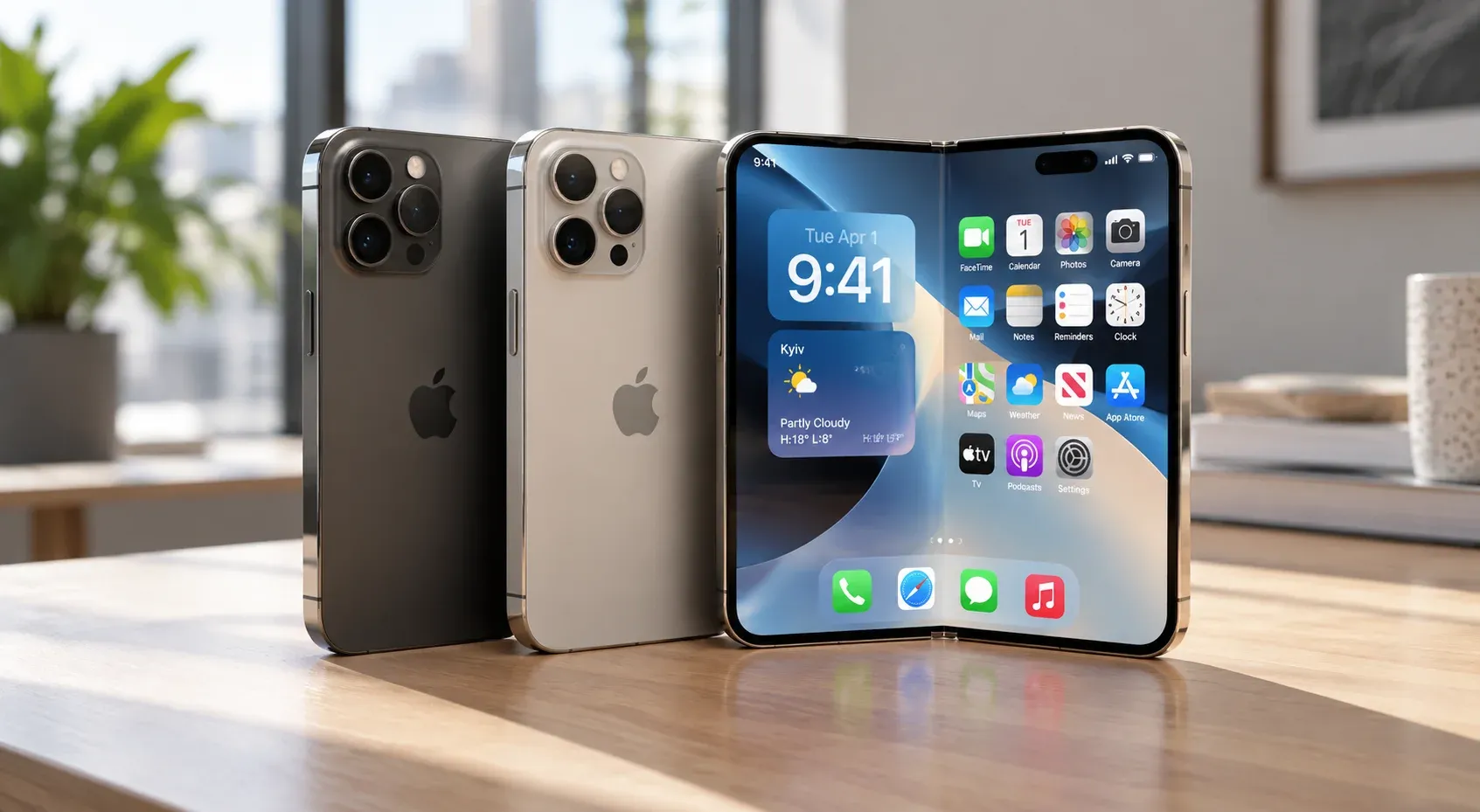
The iPhone Duo concept is straightforward: the outer display handles quick tasks, the inner display delivers immersive experiences, and transitions between them should feel seamless. The challenge is that flexible layouts must adapt to varying screen proportions, camera placements, and folding states.
On the inner display, size classes are regular in both dimensions, which means your app can support sidebars and persistent split views. On the outer display, expect compact size classes similar to traditional iPhones.
Key user interface patterns for the Duo:
- Split arrangements - side-by-side productivity views across the fold
- Overlay arrangements - content that flows seamlessly across the fold
- Vertical bar layouts - navigation bars, toolbars, and tab bars may appear vertically on the inner display
Developers should prefer NavigationStack, NavigationSplitView, or UINavigationController over custom bars. These system components adapt automatically to vertical bar behavior introduced in iOS 27.1. Use toolbarVerticalBehavior(_:) in SwiftUI or preferredVerticalBarBehavior in UIKit to control how bar items present.
Test every Duo pose in the Xcode 27.1 simulator (closed, partially open, fully open, rotated) to confirm that modals, sheets, and navigation remain discoverable. The display group option in Xcode previews lets you check the device's alternative display without launching a full simulator session.
Handle Reserved Regions, Cameras, and Occlusions
Reserved regions represent folds, cameras, and other hardware cutouts that can hide content if ignored. On iPhone Duo, the fold creates a division region, and cameras create occlusion regions that may not be symmetrical.
In SwiftUI, use GeometryReader combined with reservedRegions() APIs to detect reserved areas and offset or resize views so critical controls stay visible. In UIKit, query UIView.ReservedRegion instances and adjust frames or content insets accordingly.
Camera related concerns matter too. Outer, inner, and rear cameras may be active at different times. UI elements like shutter buttons or interactive controls must avoid reserved regions to remain usable.
During development, add visual debugging overlays that highlight reserved regions on all supported screen sizes. This makes it easy to spot content that might be hidden under a fold or camera on devices you do not yet have in hand.
Background content can safely extend into reserved areas for visual continuity, but foreground controls and text must stay within safe areas.
Optimize Navigation and Content Layout for Different Screen Sizes
Good navigation depends on available space and user context, not a fixed tab bar design. Adopt Apple's Human Interface Guidelines for better UX, and let the platform help you create layouts that feel native.
Navigation strategies by context:
Context | Recommended Pattern |
|---|---|
Compact iPhones | Bottom tab bars, single column lists, minimal chrome |
Large iPhones | Expanded content areas, optional secondary panes |
iPhone Duo inner | Split views, three-column NavigationSplitView, persistent sidebars |
iPad | Full sidebar navigation, multi-column layouts |
Organize bar items for both horizontal and vertical presentations using semantic placements and visibility priorities. Keep primary actions prominent regardless of orientation.
Incorporate dynamic type to support responsive typography in iOS applications. Scalable text combined with system spacing ensures content feels balanced whether the device is iPhone SE, iPhone 15 Pro Max, or iPhone Duo.
Protect App's Performance Across Devices and Screen Sizes
Layout decisions directly affect performance, especially when rendering more content on large displays. More pixels, more nested views, and complex split views all add cost in memory and rendering time.
Aim for 60fps for smooth UI performance on both 60 Hz and 120 Hz screens. Use Instruments in Xcode 27.1 to measure frame rate and catch dropped frames:
- Time Profiler - identify slow code paths during scrolling and transitions
- Core Animation - measure rendering performance and detect offscreen passes
- Energy Log - track energy usage for long sessions on battery-powered hardware
Profile app startup time aiming for under 400ms. Slow launch times frustrate users on any device and may cause the system to terminate your app. Use Instruments to identify memory leaks and bloat, especially in image-heavy interfaces that expand on larger screen sizes. Downsampling large images and implementing caching strategies can dramatically reduce memory usage.
Optimize network performance to avoid slow API calls. Background work and networking calls should move off the main thread to keep navigation and gestures responsive on all iPhone models. Memory issues compound on larger displays where more data loads simultaneously, so test under realistic conditions.
Testing Strategy for Multiple Screen Sizes in Xcode 27.1
Multi-device testing is now a mandatory part of any serious release plan. Test iPhone apps across different screen sizes using Xcode simulators as your first line of defense.
A core simulator matrix should include:
- One small iPhone (iPhone SE or iPhone 13 mini)
- One large iPhone (iPhone 15 Pro Max)
- iPhone Duo (both displays and all poses)
- An iPad for apps that also run on tablets or Apple TV
Xcode 27.1 previews in SwiftUI and Interface Builder let you quickly validate changes across screen sizes without full builds. The iPhone Duo Simulator Runtime has known limitations: StandBy mode is not yet supported, and most app extensions cannot run or debug in the Duo simulator runtime. But it is still the fastest way to catch layout regressions.
Encourage real device testing in the U.S. and Canada on carrier-connected phones to observe performance, battery, and network behavior in realistic conditions. Until iPhone Duo hardware ships on October 23, simulators are your primary tool, but plan to validate on physical devices as soon as they are available.
Integrate XCTest UI tests and a small set of performance tests that run against different simulators before each release. This catches regressions early and gives you data to measure improvements over time.
Benefits of Working with SoftDoes on Multi-Screen-Size iOS Apps
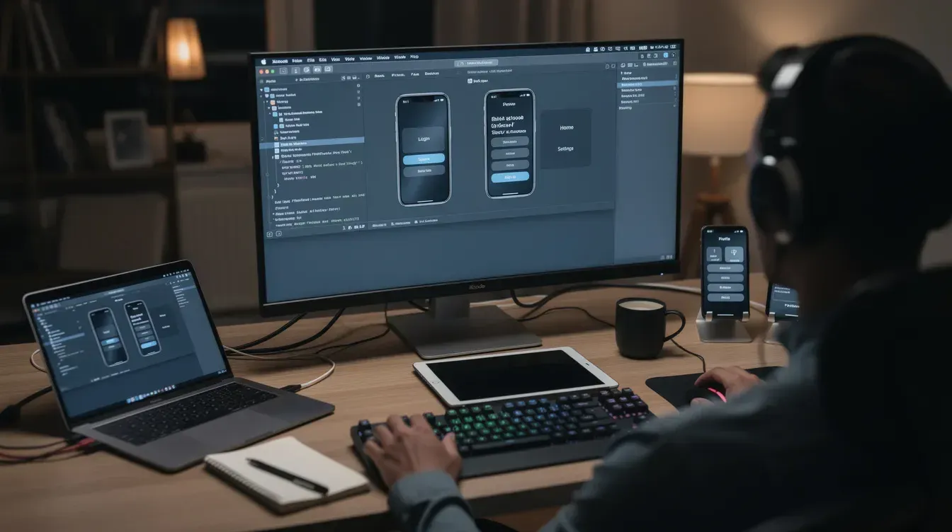
SoftDoes is a software engineering partner committed to helping enterprises and scale-ups in North America build and modernize mission-critical digital systems. When it comes to preparing iOS apps for iPhone Duo and the full range of screen sizes, expert guidance makes the difference between a smooth launch and a scramble.
Here is what SoftDoes brings to the table:
- Code audits - identify uses of UIScreen.main, fixed pixel sizes, unsupported navigation models, and legacy Objective-C layouts that resist trait-class-based adaptation
- Rapid modernization - update UI layers, swap in system navigation controls, handle reserved regions, and update deployment targets on a tight timeline
- Custom product development - build new multi-device apps from scratch with responsive design systems, accessibility (Dynamic Type, high contrast), and cloud-backed APIs, leveraging product development and engineering services
- Custom software development - modernize legacy codebases, integrate AI-assisted UX optimization, and deliver data engineering tuned for high-traffic mobile workloads with custom software and app development services
Typical engagement models include targeted consulting to get an app ready for iOS 27.1, complete development of a new multi-device app, or long-term modernization of legacy codebases. SoftDoes can also help teams develop internal device labs, run performance profiling, and mitigate risks of App Store rejections related to layout or occlusion issues.
Next step: Schedule a free discovery call with SoftDoes to review your current app behavior on different screen sizes and define a concrete optimization roadmap before the iPhone Duo ships.



Comments (0)
No comments yet.